CDC.gov Digital Modernization
Content Testing, Surveys, Interviews | 9 months
CDC.gov was composed of several distinct microsites, causing confusion and frustration for users as they tried to find information. As consultants for CDC.gov, my team and I were consulted to rewrite content and test with users.
My role:
UX Researcher
Operations Lead
Key Methods:
Surveys
User Interviews
Moderated / Unmoderated Content Testing
Progress Tracking in Jira
Qualitative / Quantitative Analysis
Timeline:
9 Months (Planning to Report)
Tools:
MS Forms, Excel, PowerPoint
Qualtrics
Mural
Jira
I developed the process for 5 technical writers, 4 plain language subject matter experts, and 2 content strategists to rewrite 150 pages in preparation for user testing, and was part of the UXR team that ran content testing for all pages.
Key responsibilities included:
Research Operations
Research Plan and Study Design
Survey Development and Instrumentation
Moderating / Facilitating Sessions
Analysis/Synthesis
Findings/Recommendations
Presentations / Readouts
The Project
CDC.gov was comprised of several distinct microsites with over 200,000 pages of content, causing confusion and frustration for users as they tried to find information.
To address this, CDC.gov developed a new content editor designed to standardize and optimize content for its 3 main audiences: public health professionals, healthcare providers, and the general public.
As consultants for CDC.gov, my team and I were consulted to rewrite content using the new editor, and test the rewritten content with end users across the 3 main audiences.

The Approach
Through content (usability) testing on desktop and mobile devices, we wanted to determine if users:
were able to find the main message
understood the main message
knew what to do if there is a call to action
considered the page to be user-friendly and appropriate for their background
Goal 1: Use feedback to determine if the new editor supported production of user friendly content appropriate for each audience.
Goal 2: Create a repository of tested pages for writers to reference as they rewrote additional content.
Why content testing?
content testing helps us evaluate if users find content easy to read, scan, and understand
this testing can also ensure the content’s tone and voice match the intended audience
testing with end users can highlight issues with usability and accessibility
Timeline & Research Strategy
Rewriting Content
Writers used the new digital editor (not shown in this case study) to rewrite CDC.gov webpages.
To manage and monitor the rewrite process for testing, I created a Kanban board of tickets in Jira to track the status of pages as they were being rewritten, reviewed, and prepared for user testing. Each ticket included:
a URL link to the original CDC.gov webpage, the name of the assignee tasked to rewrite the page,
the name of a peer reviewer, the status of the ticket (all tickets started as "To Do") and
a link to additional guidance on best practices for rewriting a page (AC and Testing Steps not shown in the image below).
Using these tickets, we were able to track work to be done, in progress work, and completed work across all writers, subject matter experts, and content strategists.
Testing Content
I collaborated with the team to develop a rapid testing strategy to test on average 2-5 studies in a week, with reports/findings going to CDC over the next 1-2 weeks. The process included:
determining study set-up and which webpages to be included in a study (each study consisted of 2-3 webpages to test)
developing the weekly testing and reporting schedule,
developing a kanban board to track the development and staging of tests,
collaborating with 2 research assistants to build and stage tests in Microsoft Forms,
running moderated and unmoderated tests, and
analyzing data and reporting out findings to CDC
Participants
223
Members of the General Public
Included mobile and low e-health literacy
80 pages reviewed
Moderated usability, 45 min.
72
Healthcare Providers
Included physicians and nurses
36 pages reviewed
Unmoderated survey, 30 min.
36
Public Health Professionals
Included researchers and public health employees
12 pages reviewed
Unmoderated survey, 30 min.

Analysis
I analyzed the quantitative data in Excel, and the qualitative Data in Mural, using Thematic Analysis.
To score the Likert scale, I converted ratings to a point scale, and for each question, calculated the average score across all respondents.
Scores higher than 3.5 were considered successful.
Results
Users found page summaries (key points) useful when they included bullet points, a clear main message and a behavioral recommendation.
Users prefered bullet points, especially when they were used to break up long content and highlight important details.
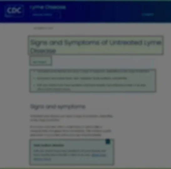
Users preferred shorter, concise pages, over longer, dense pages even for pages that included regulations and procedures. The image shows an example of a page users thought was too long.
Users relied on clear, meaningful headings that made it easy to scan a page.
Healthcare providers in particular noticed when content was too basic for their professional background.
Pages that use accordions have a high interaction cost. When overused they may make some pages feel too long.
Recommendations

Best performing pages were also selected as templates that writers could reference during the full rewrite process.
